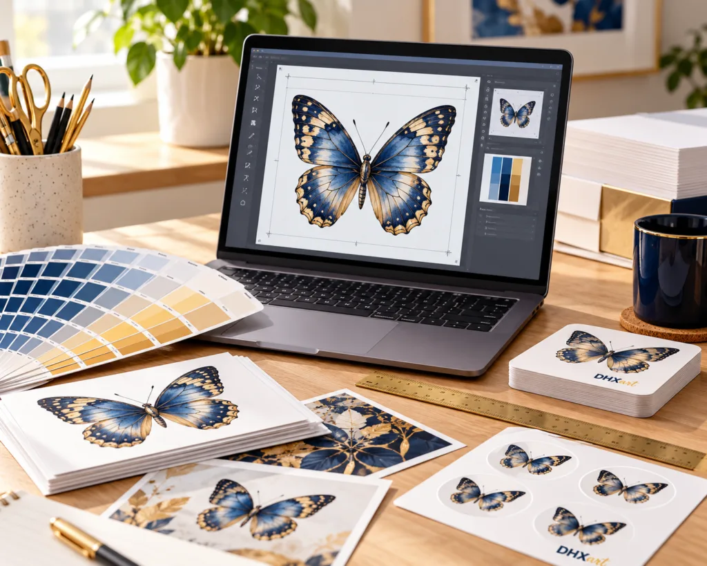
Good print starts with good artwork. A photograph, logo or graphic can look sharp and bright on a phone yet still print soft, pixelated, too dark or slightly different in colour. This guide explains how to prepare files for stickers, labels, photo products, magnets, signs and other printed products with fewer surprises.
Resolution: PPI, DPI and why image size matters
For photographs and other raster images, print quality depends on the number of pixels available at the final printed size. A strong target for detailed print is 300 PPI at the final size. The term “300 DPI” is commonly used by customers and print software, although technically PPI describes image pixels while DPI describes printer dots.
Increasing the physical size of a small image does not create real detail. Software can invent extra pixels, but it cannot recover detail that was never captured in the original file.
Useful pixel dimensions at approximately 300 PPI
| Final print size | Recommended image size | Typical use |
|---|---|---|
| 25 × 25 mm | Approx. 295 × 295 px | Small sticker or label |
| 50 × 50 mm | Approx. 591 × 591 px | Medium sticker, logo label |
| 75 × 75 mm | Approx. 886 × 886 px | Large sticker or small photo product |
| 100 × 100 mm | Approx. 1181 × 1181 px | Photo magnet, larger label |
| A6 — 105 × 148 mm | Approx. 1240 × 1748 px | Cards, small signs, photo prints |
| A5 — 148 × 210 mm | Approx. 1748 × 2480 px | Signs, plaques, larger photo products |
| A4 — 210 × 297 mm | Approx. 2480 × 3508 px | Posters, signs and large print |
What resolution should I use for stickers and labels?
For most sticker and label artwork, prepare the design at the final print size at around 300 PPI where possible. Very small text, thin lines and tiny details need extra care because they become harder to reproduce as the sticker gets smaller.
For logos, line art, text-heavy labels and QR codes, vector artwork or a high-quality PDF is usually preferable to a low-resolution screenshot because vectors can be scaled without becoming pixelated.
What about photographs and personalised products?
Use the original camera image wherever possible. Avoid screenshots, images copied from social media and photographs sent through messaging apps, because these are often resized or compressed.
For photo magnets, cards and personalised gifts, choose a clear image with good focus, balanced lighting and enough space around faces or important details for cropping. A slightly larger original gives more flexibility than an image already cropped tightly to the subject.
Raster vs vector artwork
Raster images such as JPG, PNG and WEBP are made from pixels. They are ideal for photographs but have a fixed amount of detail. Vector graphics are built from mathematical shapes and paths, which makes them ideal for logos, icons, text and line artwork that may need to be resized.
PDF files can contain raster images, vector graphics or both. A PDF is not automatically high quality, so the quality of the content inside the PDF still matters.
RGB, sRGB, Adobe RGB and CMYK
Colour is one of the most misunderstood parts of print preparation because screens and printers create colour in different ways.
sRGB
sRGB is the most widely used RGB colour space for phones, websites, online shops and general consumer photography. For most customer-supplied artwork it is the safest RGB choice because it is interpreted consistently by a wide range of devices and software.
Adobe RGB
Adobe RGB (1998) has a wider colour gamut than sRGB, particularly in some greens and cyans. It can be useful in colour-managed photography and professional design workflows where the application, monitor and output process all understand the embedded ICC profile.
However, an Adobe RGB file viewed by software that ignores its colour profile can appear dull or incorrectly saturated. If you work in Adobe RGB, keep the colour profile embedded in the file and avoid converting it repeatedly between colour spaces. For general web-to-print uploads, sRGB is often the more predictable choice unless a specific print workflow requests Adobe RGB.
CMYK
CMYK describes colour using cyan, magenta, yellow and black inks or toner. Commercial print workflows ultimately reproduce colour using a print process rather than emitted screen light. Some bright RGB colours — especially neon-like blues, greens and reds — cannot be reproduced exactly in a CMYK print gamut.
Depending on the product and production workflow, customer artwork may be converted into the appropriate print colour space during production. This is one reason an exact screen-to-print colour match cannot always be guaranteed.
Why printed colours can look different from your screen
A screen creates colour using light. Printed colour is viewed by reflected light from ink, toner and the material beneath it. The two can never behave exactly the same way.
- Screen brightness: a phone at maximum brightness can make an image look lighter and more vivid than the final print.
- Display technology: OLED, LCD, tablet and laptop displays can show the same file differently.
- Colour profiles: sRGB, Adobe RGB and other profiles describe colour differently.
- Calibration: an uncalibrated monitor may be too warm, cool, bright or saturated.
- Print material: matte, gloss, transparent, Kraft and other surfaces affect perceived colour.
- Ambient light: a print can look different under daylight, warm indoor lighting or fluorescent lighting.
Why monitor calibration matters
Professional colour work uses a calibrated and profiled monitor. Calibration helps the display show brightness, white point and colour more consistently. It does not make a monitor identical to a printer, but it gives a more reliable starting point for judging photographs and artwork.
If colour is critical, do not judge the file only on a phone screen. Use a reasonably calibrated display at sensible brightness and remember that highly saturated screen colours may fall outside the printable gamut.
Brightness and shadow detail
Images that look fine on a bright phone can sometimes print darker than expected. Check important faces and objects in the shadows, avoid crushing dark tones to pure black unless intentional, and do not rely on maximum screen brightness when editing photographs.
Best file formats for print artwork
| Format | Best for | Notes |
|---|---|---|
| JPG / JPEG | Photographs and full-colour images | Use a high-quality export. Repeated saving can add compression artefacts. |
| PNG | Logos, graphics, transparency | Useful for transparent backgrounds and sharp digital artwork. |
| WEBP | High-quality modern raster images | Efficient compression, but ensure the source was not already heavily compressed. |
| Print-ready layouts, vectors, text and mixed artwork | Often the best option for designs created in professional layout or vector software. |
Use the formats and file-size limit shown in the upload field for your chosen product. JPG/JPEG, PNG, WEBP and PDF are common print sources, but acceptance can vary by product. Supply the highest-quality original that the field accepts.
Bleed, trim and safe area
If a design prints to the edge, the artwork may need bleed — extra image area extending beyond the final cut line. This allows for normal cutting tolerance without leaving an unwanted white edge.
Keep important text, logos, faces, QR codes and other critical details safely inside the cut edge. Do not place essential information directly against the border.
Transparent backgrounds and white artwork
PNG and suitable PDF artwork can preserve transparency. This is especially important for transparent stickers or die-cut designs. Remember that white artwork may be difficult to see on a white editing canvas, and transparent products can behave differently depending on the colour of the surface underneath.
QR codes need more than high resolution
A QR code must remain readable after printing. Use strong contrast, preserve a clear quiet zone at least four QR modules wide on every side and avoid making the code too small. If a logo is placed in the centre, it should not cover too much of the code. Always test the final design before ordering a large quantity.
For very small QR labels, vector or high-resolution source artwork is preferable because blurred module edges can reduce scan reliability.
Artwork from Canva and similar design tools
Canva and similar tools can produce good print artwork when exported correctly. For designs containing text, logos and vector elements, choose a high-quality print-oriented PDF export when available. For photographic artwork, use a high-quality PNG or JPG and avoid unnecessary compression.
Avoid screenshots and messaging-app copies
A screenshot may be enough for reference, but it is rarely the best print source. Social networks and messaging apps often resize and compress images automatically. Whenever possible, upload the original photograph or original exported design file.
Before you upload your artwork
- Use the original image or design file whenever possible.
- Aim for around 300 PPI at the final printed size for raster artwork.
- Check that faces, text and logos are sharp at 100% view.
- Keep important content away from cut edges.
- Use vector or high-quality PDF artwork for logos, fine text and QR codes where possible.
- Use sRGB for predictable general-purpose RGB artwork; if using Adobe RGB, keep the ICC profile embedded.
- Remember that screen colour is not an exact prediction of printed colour.
- Test QR codes before submitting the final artwork.
- Check the accepted formats and file-size limit in the product upload field.
Need printed stickers, labels, magnets or business products?
Prepare the best-quality artwork you have and choose the product that suits your application. Clear source artwork gives us the strongest starting point for a clean printed result.
Frequently asked questions
Is 300 DPI always required?
No single number guarantees quality, but approximately 300 PPI at final size is a strong target for detailed raster printing. Some artwork can print well at lower resolutions depending on viewing distance, subject matter and final size.
Should I send RGB or CMYK?
For general customer artwork, a correctly embedded sRGB file is usually a safe choice unless a particular product or professional workflow specifies otherwise. Adobe RGB can be useful in a managed photographic workflow. Print production may require conversion to an output colour space.
Can DHXart make a low-resolution image sharp?
Software can resize or enhance an image, but it cannot recreate all detail missing from the original. Supplying the highest-quality source file remains the best option.
Why does my print look darker than my phone?
Phones are bright, illuminated displays. Prints reflect ambient light. High screen brightness, display calibration and differences in printable colour gamut can all make the same image appear different.
Artwork proofs and production
If an artwork proof is offered and selected for your order, review it in My Account. Check spelling, layout, cropping and QR destinations before approving. Production remains on hold until you approve the artwork; after approval, changes may no longer be possible once production begins. A screen proof checks the design and does not guarantee an exact printed colour match.
Standard production is 2–5 working days. For orders requiring proof approval, the production period starts after approval. Delivery time is separate; check the options at checkout.
For artwork requirements or a custom project, email info@dhxart.com. Only supply images and graphics you have the right to reproduce.
Reviewed: 5 October 2026.